BRIDGEGOOD Get Involved Feature
BRIDGEGOOD is a non-profit design studio dedicated to equipping recently graduated creatives from marginalized communities with tools and resources to find meaningful design careers by bridging the digital literacy and opportunity divide.
The new Get Involved feature allows options for past graduates of the program to give back by volunteering or donating.


Overview
BRIDGEGOOD is a non-profit design studio dedicated to equipping recently graduated creatives from marginalized communities with the tools and resources to find meaningful design careers by bridging the digital literacy and opportunity divide.
After conducting surveys, we found that users desired community involvement but struggled to figure out how to get involved.
Team
Product Manager: Shaun Tai
Designers: Marybeth (me), Siripat, and Mariya
Engineer: Trung
Problem
How might we improve the website’s user experience to get users to be more
involved with the BRIDGEGOOD community?
Solution
According to user data, our team decided to create a feature that allows options for past BRIDGEGOOD graduates to give back by volunteering or donating.
Tools
Figma
Adobe Illustrator
Adobe XD
Adobe Photoshop
Duration
3 Week Sprint
Research
Our team conducted six interviews with BRIDGEGOOD graduates to gather their thoughts on the current web design of BRIDGEGOOD.com. Our findings discovered that while many graduates desire to get involved with the BG community after graduating from the program, they are unaware of the already existing feature to do so: the “Impact” page. This led our team to re-design the user flow, as well as the Impact page as a whole, renaming the page to “Get Involved.”
User Persona

Our team created a survey for BRIDGEGOOD graduates to fill out their responses. Based on user feedback, we designed a user persona that reflects users’ goals, motivations, and frustrations. This persona represents the average BRIDGEGOOD graduate.
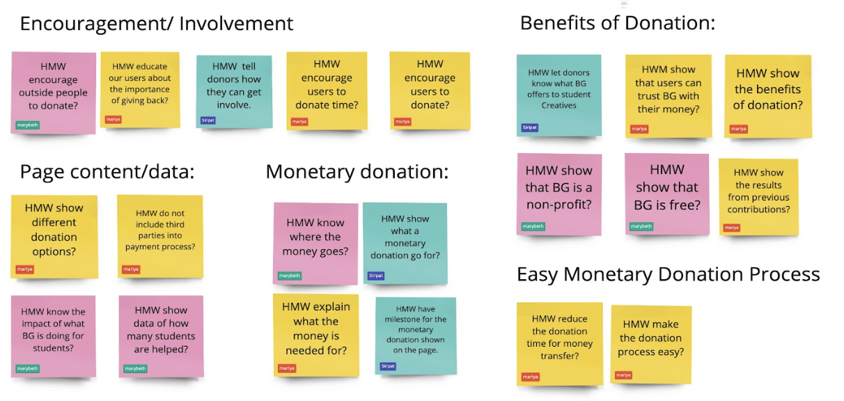
How Might We’s and Brainstorming
Because our research indicated that community involvement is important to users, we decided to re-design the “Impact” page.
We brainstormed ideas to make the “Impact” page more visible from our User Persona’s perspective and needs.
Since users expressed a desire to give back, we categorized our ideas based on whether they decide to volunteer their time or money.

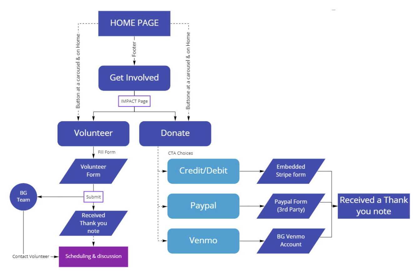
User Flow and User Journey
There was only one entry point that led to the “Impact” page, which was located at the footer. It was titled “Donate”.
After conducting usability tests, we discovered that users found difficulty finding the Donate and Volunteer page.
We then decided to add two more entry points; on the home page and the page itself.

High Fidelity Modifications
1.
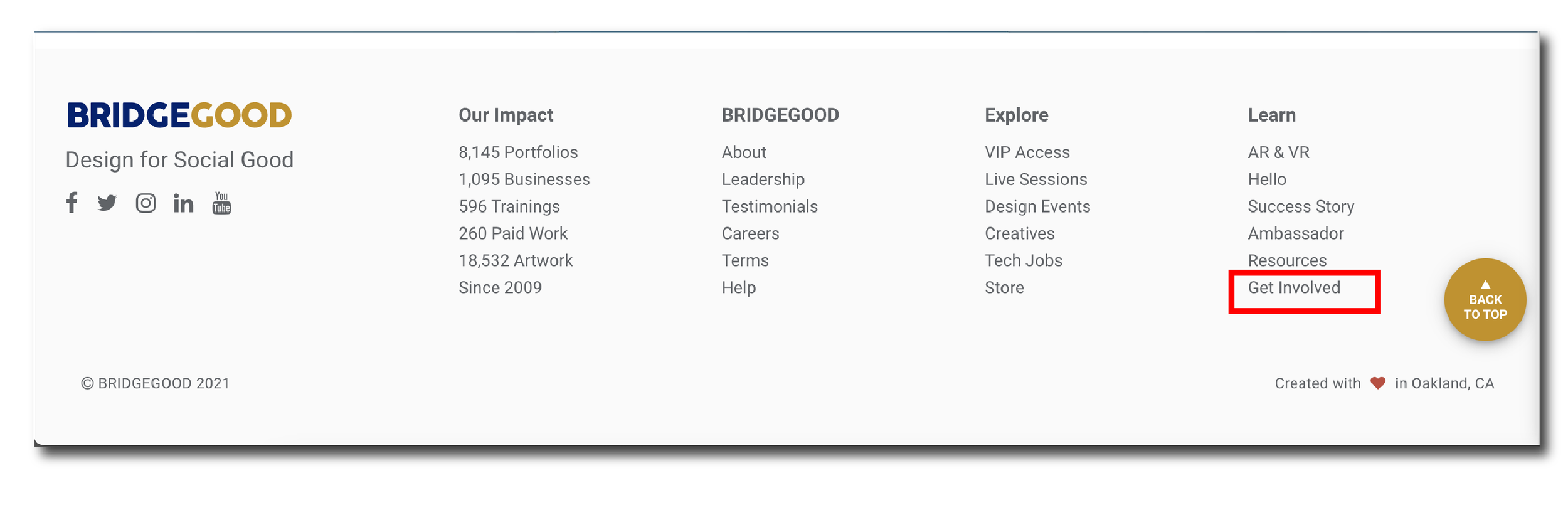
On the footer of bridgegood.com, we renamed “Donate” to “Get Involved.”
Responses from our user usability testing indicated that participants were not able to find a way to get involved through the home page.
With the small modification on the footer, 6 out of 10 participants clicked on the “Get Involved” when asked, “What would you click on if you wanted to be more engaged in the community?”
Before
After

2.
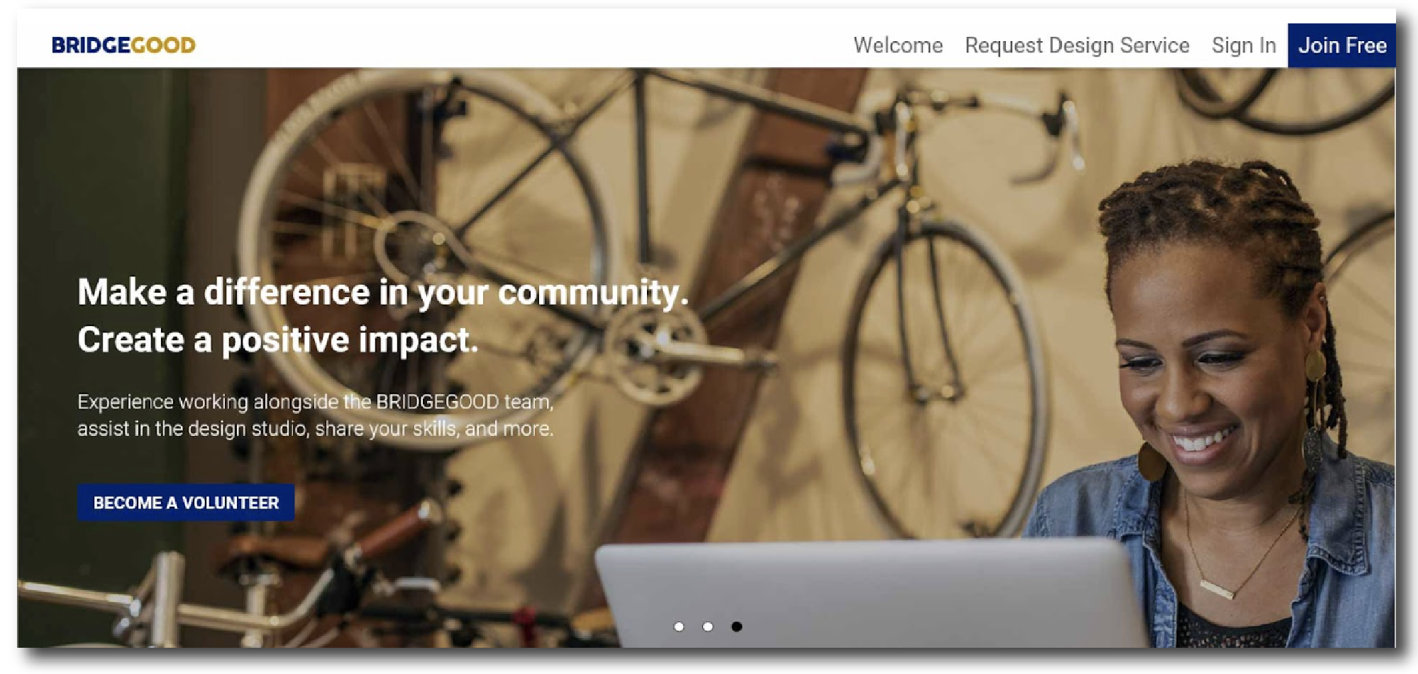
Included Call-To-Action buttons on Hero Images
To create higher visibility, we added CTA buttons on hero images that lead to the Get Involved page.

Usability Testing
My team created a prototype of a new Get Involved page, in which participants were gathered to view our prototype. They were requested to verbally describe their thought processes.
Here’s some of their feedback:
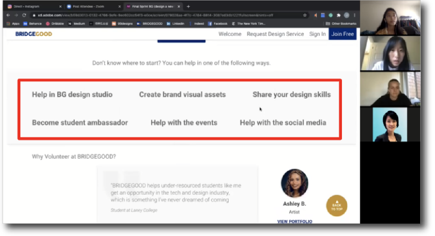

Users wanted to see specific roles with a description included.
Users would like to see one Donate button instead of two.
High Fidelity Wireframes
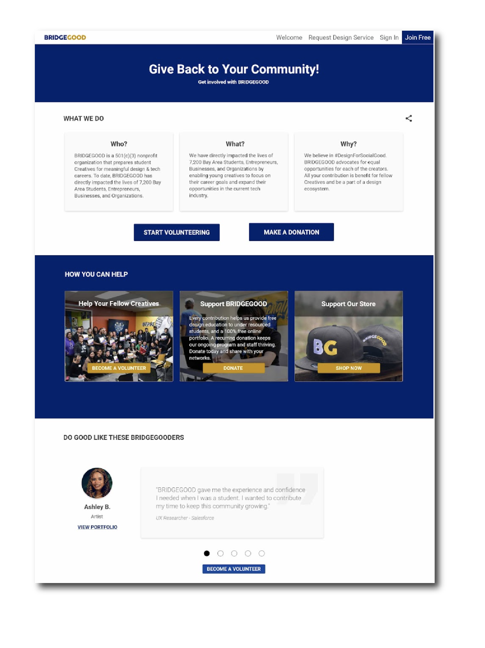
Using the recommendations from our user testing, we incorporated an empathetic approach to why BRIDGEGOOD creatives and non-creatives should donate to the non-profit organization.
We included different options for users to choose from, however big or small they are able to contribute: from volunteering to check out the shop.


High Fidelity Walkthrough
Takeaways
Working with a live, existing product.
This was my first real-world experience outside of school. This entailed working to improve an already existing product for a business, within brand guidelines understanding the needs of our demographic audience, and presenting to stakeholders, all within a short time frame.
Learning How to Design with an Inclusive Mindset.
As a User Experience/Interaction Researcher, I put the perspective of the users first. Listening and applying feedback made the flow much easier for the user.
Organizing Feedback
Each user had their own set of varied feedback, that differentiated from others. We found common patterns and used that for our reiterations.